(11 crucial steps for your branding or rebranding project, including one I missed)
Table of Contents
1. Create a Pinterest board
2. (Shoot) Plan shots around business needs
3. (Shoot) Plan shots around copy needs
4. (Shoot) Specify layout and photo directions
5. (Website) Remember there’s no such thing as a “small redo”
6. (Website) Build on a user-friendly platform
7. (Website) Have a system for assigning tasks and keeping track of pages
8. (Everything) Have a team member for tasks and details that aren’t your specialty
9. (Everything) Start early, and allow plenty of time
10. (Everything) Let go of stuff you don’t want to do
11. (Everything) Work with great people!
A website and branding redo is no small, or inexpensive undertaking. So let’s start with this:
Why I redid my site (even though I didn’t “need” to)
When it comes to change and spending money, I’m from the “if it ain’t broke…” school of thought.
My longtime designer/developer and great friend, MM, on the other hand, has been gently suggesting we do a refresh for a couple of years. “I know it feels like we just put it up, but your site *is* four years old,” she said in early 2018.
How did high school feel so long, but four years since a website launch — never mind, I know, aging, speed of life, etc.
Now, we’re relaunching at the 5-year mark. Not a moment too soon. As MM says, “Having a five-year-old website is like driving a Model T.”
Here’s the thing:
I still liked my site. And it worked!
People read the copy and hired me – without a single sales call. And they said they loved my branding. If someone likes something about you, you can’t change it. Everyone knows that. (Flashback to me in 6th grade, wearing the same pair of electric blue acrylic Hotsox for weeks on end because popular girl Carney Carterra said she liked them. I don’t think she even meant it. She definitely didn’t mean it.)
And yet…my business had changed. Or, I had. OK, both.
I’d realized that, to have the kind of business and life I want, I’d have to stop being seen as “so-and-so’s copywriter” or whatserface’s “secret weapon” and become a star in my own right.
Yes, a STAR! I know that sounds very “who does she think she is,” desperate fame whore buying herself a billboard on Sunset.
But my dream has always been, get paid to be me. And it turns out…
Getting paid to be you requires that people know and see you.
To that end, there was one lone photo of me on my main site…from 2012. Buried on my About page.
People would ask, “Why aren’t there any pics of you?” and I’d say, “I don’t want it to look like everyone else’s site with that same ol’ full-bleed pic in the header. Plus, the site’s not about me. It’s about the clients and the copy.”
Guess what: I change my mind! OK, I still refuse to look like everyone else. But as for who it’s about….well, there’s room for all of us. Me, you, and the copy.
Mostly, the site wasn’t really serving my newer business goals: to sell my products and build my list. (Because email is everything, which means so is your list.)
When I last redid it in 2014, I didn’t sell any products or courses. My emails didn’t have a strategy – even if they were fun to read – which made list-building feel pointless. All I used the site for, really, was getting clients.
The site was great at getting me clients — too good.
I didn’t want so many clients. Maybe I didn’t want any. Say wha???
So, it was time for something new. A site that:
- Makes it impossible for anyone with a heartbeat, a sense of humor, or a desire to learn copy (pick one) to resist signing up
- Entices you to buy my courses
- Greets you with my mug at every turn. Yep, it’s “Me Me Me Magazine.”
And speaking of magazines…that was my vision for the site. I’ll get to that.
First, the players I’ll be mentioning:
- Michelle Martello, AKA Smartello, AKA MM, my designer/developer/consigliere for all things digital
- Sandra Booker, my business manager and fresh set of eyes, among other things
- Elsa Isaac, stylist for my big shoot
- Eric Michael Pearson, AKA EMP, photographer extraordinaire and shoot director
How it all came together (steal these steps)
Hold on, though. Before you read, don’t get intimidated. Not every site redo has to be a behemoth. I happen to be a big adder-on-er. It’s why I can’t leave Bed, Bath and Beyond without grabbing every gadget and doo-da and earbud case at the register. K then. My steps…
1. Create a Pinterest board
I started with a vision. I’m not the most visionary or visual person, but I knew what I wanted it to feel like:
A 1980 magazine. Specifically, the ads. I’m a 70s/80s kid and forever nostalgic for that era, the whole look of it.
I put together a pinterest board that kept me up till 3 or 4 many nights. (Husband: “Why are you up so late? Come to bed, Obsesso!”)
I googled “80s print ads” “70s print ads” “1980 magazine ads” etc, and added the ones with the look I liked to the board.
Look closely and you’ll recognize the inspiration behind a bunch of my new website photos.
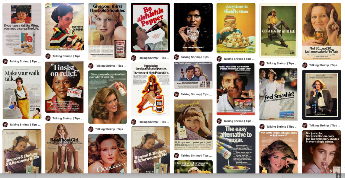
I shared this board first with MM and then with the whole team once I had my shoot booked.
2. (Photo Shoot) Plan shots around business needs
Even before I decided to do a total site redo, I knew I needed new photos.
(My previous (and first ever) shoot was in 2016, and I’d used and loved those photos to death.)
This shoot wasn’t just for the website, but also for photos I’d use on Instagram, in media, speaker headshots, keynote slides, affiliate promotions and who knows what else. So I needed a lot of looks.
Elsa shopped for looks inspired by the Pinterest board: a mix of 1980-ish styles that could also be current.
EMP and I brainstormed how to do the whole thing in my apartment. I’d learned, from not having enough of either, that I needed the following types of shots:
a. Seamless
Seamless photos are the ones with the blank background. These are handy and/or necessary for:
- Headshots. Anyone who features you on their sales page prefers a photo on a clean background.
- My website shots. Because that’s the look I wanted.
b. Environmental
These are the more casual ones with, well, an environment in the background. Of you at home, in a coffee shop, traveling, pretending you’re hailing a cab in the Meatpacking District, etc.
Now, my nature is to go against the grain and not take the photos everyone else uses: me with laptop on the couch, me with laptop at my desk, me happily working and smiling, me pointing up, me pointing to the side, etc.
But since my first shoot, in 2016, I’ve learned that those are the shots you end up needing the most, especially for media. I make a practice of guest posting in publications like Money and Business Insider, and the most-shared articles are the ones with a photo of me working.
If you’re talking about your work, you’ll want pics of you working.
If you talk about your great lifestyle, you’ll want pics of you baking, sailing, drinking your dumb green juice, and, most of all, looking cute while doing JACK SHIT. That’s just how it goes. Those pics support your message.
3. (Photo Shoot) Plan shots around copy needs
I didn’t merely tell EMP which ads I wanted to emulate and which props I wanted to hold; I gave him a whole list of possible copy lines, so he could direct me with corresponding expressions and poses.
Now, this is where I really geek out. I love brainstorming taglines and headlines, and once I do, best believe I want great images to use with them.
NOTE: My agenda isn’t typical, because I was going for vintage-ad shots and old-school commercial lines to go with them. But the section with lines for casuals might be handy inspiration for yours. And whatever photos you take for your business, always think about what copy you’ll want to pair them with.
My list went like this (I won’t give you all the lines, just one or two I gave him for each prop — bc gotta keep a little mystery!) :
Possible products (shoot all with and without product in hand)
Cereal (eating from bowl, cereal box insert)
Instant coffee (drinking coffee, glass instant container insert)
Pain meds (holding box or bottle for some, holding head or feeling great for others)
Lip gloss (holding notebook? with product insert)
Soda can (holding can)
Soda bottle (holding bottle, or doing something joyful with insert)
Hair spray (spraying on hair)
Types of lines that might go with these
Cereal:
– WORDS THAT STAY CRISP
– HAVE THE COMPETITION FOR BREAKFAST
Instant coffee canister and coffee mug:
– WAKE UP YOUR COPY…AND YOUR SALES
– STIR IN THE BOLD, RICH FLAVOR OF PERSONALITY
– GIVE YOUR BRAND AN INSTANT BOOST
Pain meds:
– NO MORE COPY HEADACHES!
– RELIEF FROM THE PAIN
Lip gloss:
– MAKE YOUR BUYERS SMILE
– BE THE NAME ON EVERYONE’S LIPS
Soda:
– BE A SHRIMPER!
– JOIN THE LIST…AND TASTE THE DIFFERENCE
Hair Spray
– SHINE AND BOUNCE FOR YOUR BUSINESS
– GIVE YOUR WRITING FABULOUS TEXTURE
Lines/sentiments for casuals (READER: think about (but don’t steal) these for your own business)
- EMAILS THAT GET OPENED ASAP
- NAILED IT!
- TFW YOUR WRITING CONNECTS
- NOTHING BEATS A BUSINESS WITH PERSONALITY
- WOW, WHAT A DIFFERENCE
- YOU’RE A CREATIVE GENIUS
- RELEASE THE HOUNDS…OF GENIUS
- OH YES, I DID JUST SAY THAT
- OOPS, DID I JUST SAY THAT?
- THIS IS AWKWARD
- WHAT’S THAT SOUND?
- OY! WRITING IS HARD.
- YAY! WRITING FEELS GREAT!
- IT’S ALL ABOUT THE TINY DETAILS
- DON’T MAKE THESE MISTAKES
- YOU NEED THIS SHIT
- I’LL SHOW YOU HOW
- I’LL MAKE IT EASY
- WORDS THAT HAVE THEM AT HELLO
- GIT ‘ER DONE
- A BRAND THAT MAGNETIZES
- THIS IS THE MAGIC YOU WANT
- COPY THAT DOES THE WORK FOR YOU
- YOU GET TO SIT BACK AND WATCH NETFLIX
- DANCE LIKE YOU FINISHED YOUR COPY
- BE INSTANTLY RECOGNIZABLE
- YEAH, YOU
- WHO, ME?
- I’M SO FLATTERED
- HOW TO WRITE YOUR ____
- FULL OF IDEAS
Lines/sentiments for seamless – same as above, and add…
- WE’VE TEAMED UP
- TALKING SHRIMP + ______!
- THE BEST BONUS OF ALL TIME
- HOLY SHIT
- MIND. BLOWN.
4. (Photo Shoot) Specify layout and photo directions (ie, avoid my mistakes)
EMP is a commercial and artistic photographer who takes incredible, eye-catching portraits (often of comedians), which is part of why I love and wanted to work with him. I knew my pics would be different from anyone else’s. (Also, he knows how to direct me and make me look good. So.)
Even when you work with an experienced “branding photographer” — someone who specializes in photos for soloprepreneurs, coaches, freelancers, experts, and influencer-types with personal brands — it’s up to you to get specific with your photographer about these things I forgot to think of:
1 – Photo orientation / dimensions
I should have gotten just about every environmental shot in landscape, and every seamless shot in the clear (meaning, with space on either side of me rather than cropped). Landscape layout is what’s used for social sharing of articles, and uncropped photos give you much more flexibility for website headers. My Work With Me page header is an example of a shot that we would’ve liked to use as a full-bleed image. MM got creative, though, and used the cropped photo in a way that gave it that magazine look I wanted, anyway.

2 – Eye and hand direction
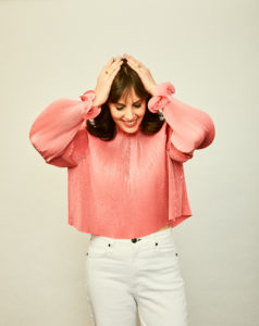
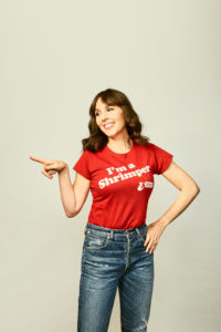
If you have text on your shirt, you can’t just flip the photo. Remember to point and look in both directions so you have more options with copy next to each image. Also, some looking up, some looking down. Those, I got.
5. (Website) Remember there’s no such thing as a “small re-do” (ie, don’t kid yourself)
Website rebranding or home renovation: it’s never going to be as quick or small as you think.
Actually, there are so many similarities between a website redo and a home renovation.
We set out to do the equivalent of a paint job and some new countertops. As time went on and we saw how much could use changing, the project grew and grew. We ended up taking it down to the studs. And, sure enough, MM found a bunch of mold and rot in my wordpress backend. And years of hoarded clutter.
Hoo boy. Pages and pages and post drafts and other debris and crap I didn’t need. Picture a truckload of Goodwill bags filled with scraps of copy I was tempted to keep but had to let go of. My site was never going to wear them.
We had to Kondo the whole thing. Except instead of asking, “Does this spark joy?” we asked, “Does this spark sales?”
MM and I didn’t have a specific launch date for the site, so we spent the better part of 4 or 5 months tossing around layout ideas until we had some momentum, and spent around the past 2 months firing all cylinders. All told, it’s been nearly a year since the shoot.
6. (Website) Build on a user-friendly platform
As a copywriter, I’m biologically wired to get into the backend and futz with my copy myself. Having to hand over finished copy before I see it on the site, or ask my d/d to make changes for me, would make me lose my everlovin’ mind.
A ton of the design is custom, but the brilliant MM coded it so I can play around without worrying about HTML. She sometimes has to tutor me more than once in how to add a row or change the font setting. But I mostly have the hang of it.
7. (Website) Have a system for assigning tasks and keeping track of pages
If you think a website is just a homepage, about page, and contact page, oh my. You’re in for a treat. By treat I mean rude awakening. Here’s the “page” column of the spreadsheet MM put together.
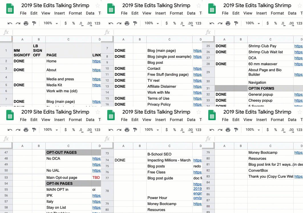
And here’s how we communicated within the sheet:

8. (Everything) Have a team member for tasks and details that aren’t your specialty
I’ve delegated certain jobs to Sandra, like:
- Sourcing props and painting them white for the shoot (actually, she thought of that herself)
- Organizing testimonials and headshots
- Requesting headshots
- Overseeing email sequences and tagging for each opt-in
- Testing EVERYTHING
- Reviewing content, and looking at it with fresh “buyer’s eyes”
- Listening to me ramble about sudden ideas or “second thoughts” on Voxer (also MM’s job)
Thank the LAWD for Sandra!
9. (Everything) Start early, and allow plenty of time
There were so many details to think through. So many details I wanted, that took time to create.
For instance, inspired by the old “I’m a Pepper” Dr. Pepper t-shirts, I decided I wanted one in that exact style that said “I’m a Shrimper.”
The t-shirts alone took a few weeks. We had to design them, order them, approve them, wait for them. And then, I had to try them on and re-order on a different brand of t-shirt that wouldn’t be quite so tight around the chestal region. And maybe raise the graphic a little so it wouldn’t hit at an awkward point or be all stretched out, knowha’imsayin?
10. (Everything) Don’t be afraid to let go of stuff you don’t want to do
Oh, the fun MM had persuading me to trash old pages that no longer suited my business. I’m a copy hoarder. And it’s hard for me to stop selling something that, well, sells.
Though I kept a few of those obsolete bits for viewing purposes only (consider them like part of the museum’s permanent collection), here’s where I landed:
Just because people want to hire you to do something doesn’t mean you have to say yes. It’s OK to delete the page. Don’t advertise what you don’t want to do.
11. (Everything) Work with great people!
Preferably, geniuses. But if you’re just starting out and aren’t ready to spring for high-ticket talent, at least make sure your people have the following smarts:
- They think in terms of mobile, not just desktop. MM looks at the mobile version of every section of every page as she’s designing and coding.
- They understand the scope of the job.
- They understand the business goals of your site.
- They get you and what you’re going for…and like it.
- They understand “the process” — meaning, they’re patient with you when you say you want one thing and then change your mind when you see it and want something different. MM often says, “It’s OK, this is the process.” And I love her for it.
Now you: Have you recently redone your site, rebranded, or had a big photoshoot? What tips did I miss?

Carney Carterra. That a real name? Or the made up name of the meanest mean girl in junior high school? 😉
Sincerely appreciated. I’m grateful for this wonderful article. Keep sharing!
I’m one of your new biggest fans so I didn’t get to see your previous site. But I absolutely love what you’ve done and even more: the process. Thanks for sharing.
I LOVED reading this and seeing your inspiration!!! I love the cereal metaphor and feel like I am watching an episode of That 70s Show with the outfits! Brilliant design and an inspiration for another female entrepreneur at the beginning of this journey 🙂 As an MM and Marie Forleo fan, where do you recommend starting if we are already in the midst of website creation but have a small budget? How can we do this on a much smaller scale now? Thank you!!!
GAWD this is amazing. Love the new look, love the copy, love this step-by-step case study lesson. Thank you for sharing this!
I love the new place, Laura. And I’m also suuuuuuper jealous. I hired some folks to redo my site in December (2018) and Yada x 3, they were scammers and I’m now waiting to (hopefully) get my bucks back. But now I’m stuck with a sucky Wix site I did on my own and out a whole lotta money to boot. Anyway mazal tov 🥳😭🥂. PS the execution is on point (not surprisingly).
It’s the Shrimp Club vibe released out into the woooooorld!! Words can’t express how much I love it. So here’s a bunch of emojis: 💁♀️💃🏻🕺😍🦐🔥🥂🥇
I love this! I have just been swooning all over your website. As a child of the 70s and 80s, I have all the childhood feels here. I have been thinking a lot about how I want to re-do my website (Pinterest board deployed!) and the steps I need to take and you just made it that much easier for me to figure out. Gracias!
loving this! would love an update later to let us know how the new site improved your sales and branding! thanks for taking us on the journey! super fun!
Great idea! Will do, but I can predict: very well. Some of my recent sales pages, like for Shrimp Club, were done in the new branding before the site was even up. It filled up! But even without that evidence, I’d know that it’s going to work because it makes me more excited to write and share and create stuff. One of my mottos: it pays to be prolific.
It’s SO good! xo
Thanks!
The Talking Shrimp shirt is the best! Love the overall rebranding of your site, Laura! It really reflects the playfulness of your personality AND your copy. Well done, woop woop!!! 🙌🏻🙌🏻
Thanks, Juana! I do love making t-shirts.
Laura, you’re copy always made me laugh but there were times I was like “woah” – too long. Or too boring. And how does it help me? And you’re right. You’re website did need a bit of a lift. 🤗.
But I love ya for you.
That said. I Love ❤️ Love 💗 the new website!
Great job! Would you offer more affordable course please.
You’re a genius 😘
Marla
Thanks, Marla. Lots of free stuff on my site — now more findable than ever.
This couldn’t be more perfect – both the rebrand and the how-to guide. I feel like I’ve made many of the same mistakes (getting awesome photos but that are cropped the wrong way for social media!) and there are major tips in here.
Although I don’t do as much “personal brand” stuff anymore with our bigger team at AccessAlly, this is inspiring and giving me ideas for our next brand refresh!
Now I’m off to explore the different corners of your new website, yay!
Thanks so much, Nathalie! I’ll be on the lookout for that refresh. Always inspiring to watch how you level up, each time.
As a web designer, I say Brilliant! Loved reading through all of your process and behind-the-scenes notes.
And I love the new site! I know how much work goes into such a change, and salute you and all of your awesome team for the hard work and super fun outcome. <3
Thank you so much. Yeah, only a designer would really know how much work! Glad you like.
Woohoo!! Love it Laura!! Congrats on the big 10!!
Thanks, Vita!
Woah. Woah woah woah woah. What is this place?! I love it all.
Why, it’s called Shrimpland. The internet’s most magical place. Welcome!
Thank you for sharing the behind-the-scenes of your website Laura! Such a useful blueprint for anyone doing a rebuild. Your photos are gorgeous, your copy is hilarious and so useful and your site is such a fun place to hang out. Congrats on 10 years!
Thank you so much, Kelly! Glad to have you hanging out there.
Love the new photos, Laura. Fascinating to read about the process and thinking behind them and your whole website redesign. I’m supposed to be putting together a vision board but am stuck because I really didn’t get why I should look for pics that have nothing to do with my business. I kept being told “you’re being too literal.” But seeing your Pinterest board gives me a bit more of an idea of what a vision board does. Thanks for sharing.
Oh, I’m so glad this was helpful! Hope it moves you forward. Yeah, just looking at other people who are doing what you’re doing will not only make you look the same, but will keep you stuck in comparison-land. Outside your industry is the place to look, they’re right!
“Don’t advertise what you don’t want to do. ” Love it!
It’s so insightful to see how your mood board turned into this really cool, creative re-brand that still looks and feels like the Talking Shrimp experience.
Big applause for Sandra!
Thanks, Cindy! Yep, you grabbed onto the biggest takeaway right there. You know that saying, “dress for the job you want”? Same with your website. Dress it for the job you want it to bring you.
Well done, Laura. I loved your old site and this one’s even better.
Please stop making it look so easy. The rest of us are struggling to keep up.
Thanks, Justin! Hey, it’s not like you’re out there making it look hard. You’re on fire.
This is not about me…So why do I feel so excited? Laurs, you embody *connect*-and-convert. Thank you for all the mentoring and INSPIRING! XoE
Ah, but it *is* about you, my dear Shrimper. Thank you for being here for so much of the ride!
Wow. I love it! The copy, of course! The design aesthetic! The simplicity. It’s easy to take it all in–I don’t feel pulled in a million directions. Eager to settle in and read it all. Congratulations on a brilliant redesign, AND your 10th anniversary! Must be so gratifying to celebrate your 10th year when you are at the top of your game and have achieved so much in just the past year alone!?! Thrilled for you! And for all of your readers and customers!
Thanks, Courtney! Especially for noticing the year’s worth of strides, because yes — I feel like it’s been a big year. Glad to have you around to celebrate. 🙂
I like it. Got some of the old flavor but now it feels like I’m reading a special edition of The New Yorker, and they pay a lot. Has the elegance you deserve.
Oh, you nailed just what I was going for. Well, really a vintage edition of New York Magazine, but close enough. Thanks!
The 70’s and 80’s theme is brilliant. Obsessed. So well done. Can’t wait to read the whole thing.
Thank you! Hope you liked the whole thing.